
Unlocking Zen: How R's data analysis ecosystem outshines Python
In this article, I highlight some pain-points when working with Python & Pandas and how R's ecosystem proves to be a great alternative.


Python’s dominance
I must confess, I’ve been a Python fanatic ever since I learned it back in 2018. I used to be a C++/Java guy up till this point, but Python’s ease of use is truly something else. You don’t have to think about types, pointers, creating objects, or curly brackets. Lack of some of these features has downsides, of course, but this frees you up so you can focus on the problem at hand. This leads to a multiple-fold productivity gain. Add to this the fact that it has a solid and stable standard library and a great open-source community, and it’s easy to see why it has had a meteoric rise in the last decade and a half. So much so that it’s almost impossible to escape it if you’re doing analytics in any capacity.
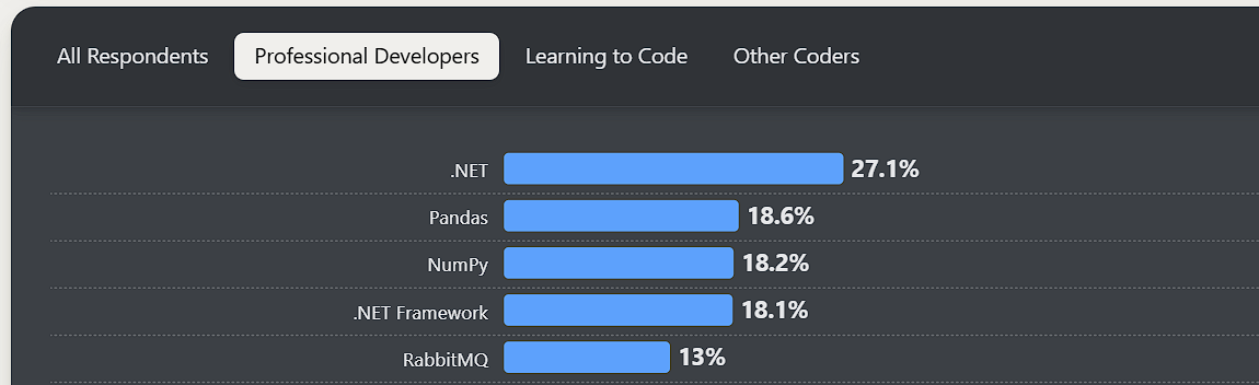
There are certain packages that have been around since forever in Python’s analytics ecosystem, such as NumPy, Pandas, Matplotlib, Scikit-learn, and so on. If your data lives on files, and more often than not it does thanks to the rise of data lakes—think Amazon S3 and Azure blob storage. Pandas is the de facto standard for doing data manipulation within Python. Even in 2025, Pandas remains one of the most widely used libraries for professional developers, followed closely by NumPy.
This is despite the fact that better solutions such as Polars exist. Let’s look at few of its drawbacks:
Confusing Syntax
Pandas uses NumPy under the hood which returns a list of bools, this can often lead to somewhat hard to follow syntax, for example:
filtered_df = df1[
    df1['id'].apply(
        lambda x: x in df2[
            (df2['budget'] > 50000) &
            (df2['status'].apply(lambda s: s.startswith('A')))
        ]['id'].values
    ) &
    df1['department'].apply(
        lambda d: d in df3[
            df3['location'].str.len() > 6
        ]['department'].values
    )
][df1.columns.difference(['join_date'])]
High memory footprint
Pandas loads the entire dataset into RAM and consumes ~5x the memory of the raw data due to its internal block-based storage and indexing overhead. The figure below is an illustration of the size of Pandas’ data frame increasing non-linearly with the size of the CSV file.

Scalability Issues
Operations such as group‑bys, joins, or even filtering can become slow as row counts climb into the millions. It also doesn’t support any parallelism as most computations are performed on a single thread, leaving a lot of performance on the table.
No lazy evaluation
Every operation executes immediately without an execution plan or reordering, unlike Spark or Polars, which can optimize whole pipelines before running.
The alte’R’native
The R language is similar to Python in many ways: it’s dynamically typed, garbage collected, has a rich ecosystem of packages, and has a large and active community. It has in-built support for vectors so nothing like NumPy is needed. While R is definitely not as mainstream as Python, it’s definitely preferred in certain niches such as biostatistics, academia, pharma, bioinformatics, etc.
Similar to Pandas, there are two go-to libraries when working with data in R. First is dplyr for data transformations and ggplot2 for visualizations. Both belong to tidyverse, a thoughtful collection of R packages for everything data science.
Let’s talk about why I think R has the upper hand when it comes to data manipulation and analysis:
Beautiful syntax
At its core, dplyr relies on a small set of SQL-like verbs, for example, filter(), select(), mutate(), summarize(), arrange(). All these functions take the same inputs, meaning they can be chained one after another similar to operator chaining in Python.
R uses something called non‑standard evaluation (NSE), so you can refer to columns directly without quoting their names. This might not seem like much but when you work with complex datasets with tens or hundreds of columns this simpler syntax quickly makes a difference.
# R Syntax
df |> filter(score > 100)

# Pandas Syntax
df[df["score"] > 100]
Then there is R’s pipe operator: |> which allows you to chain multiple operations:
df |>
  mutate(value = percentage * spend) |>
  group_by(age_group, gender) |>
  summarize(value = sum(value)) |>
  arrange(desc(value)) |>
  head(10)
What I love about this is just how intuitive this syntax becomes once you’re familiar with it. Want to modify an existing column or create a new one? Use mutate(). Need to aggregate values? Use summarize(). Want to filter rows on a condition? Use filter() and so on.
I’m also a big proponent of functional programming, and if you notice, the code snippet above follows two core tenets of FP:
Immutability: The original data frame
dfremains unchanged; we just add transformations in a non-destructive fashion. This means we don’t lose data if something goes wrong during the process.Composition: The pipe operator wires one transformation after another, allowing for composition of operations on the data frame.
As your code grows, it starts to look like a waterfall of functional transformations with a fairly small set of verbs being used most often, combined with a lack of quotes, making it great for readability.
Seamless Visualizations
These niceties of the R syntax don’t go away when the time comes to visualize your transformed data. Both dplyr and ggplot2 follow the same design philosophy and naturally get along very well, let’s look at how we can visualize our data from the previous code snippet:
 df |>
  mutate(value = percentage * spend) |>
  group_by(age_group, gender) |>
  summarize(value = sum(value)) |>
  arrange(desc(value)) |>
  ggplot(aes(x = age_group, y = value, fill = gender)) +
  geom_bar(stat = 'identity', position = 'dodge') +
  scale_fill_manual(values = c('blue', 'orange')) +
  labs(
    title = 'Ad Spend by Age Group & Gender',
    x = NULL, y = NULL, fill = 'Gender'
  ) +
  theme_minimal()
The code sample above takes our data and generates a bar chart for it. Since ggplot2 is also built to work with R dataframes, you can plug the output of your dplyr transformations directly into it.
We tell ggplot we want to plot a bar chart with age_group on the X-axis and value on Y. We then tell it to color bars for each gender differently. Finally, we set a title and labels for both axes.
In essence, it’s like building your visualizations by adding one layer on top of another, a.k.a. composition. Again, we don’t have to put column names in quotes. Also, notice how the pipe operator has been replaced with the + operator.
Multiple backends, One API
The default data structure for handling tabular data is called data.frame in R. Similar to pandas, it works by loading the whole data into RAM and consequently faces the same performance issues if your dataset is big enough.
The thing is, though, that you’re not limited to only using the default data frame; there’s another backend called data.table. It’s written in C and provides considerably more performance. And while it comes with its own syntax by default, thanks to dplyr, the same code can work with data.table.
And not just that, dplyr allows you to work with remote data stored in databases. This is great if your data already lives in a database such as SQLite, Amazon Redshift, etc. I use it with an in-process database engine called DuckDB, which allows me to handle millions of rows without breaking a sweat on a machine with less than 3 GB of RAM available most of the time. And for comparison, both data.table and DuckDB are multiple times faster than Pandas, see this benchmark.
The point I’m trying to make here is, no matter where your data lives, or how big it is, there’s something in R that can handle your needs. And it comes with consistent, readable syntax and arguably the best visualization library.
Conclusion
I recently watched a talk by Peter Wang (co-founder of Anaconda) where he makes the argument that Python has crossed “the chasm.” This is to say that it has gone mainstream. And when something goes mainstream, people don’t necessarily use it because it’s the best tool for the job; more often than not they use it because everyone else is using it.
 groups of tech-adopters : innovators, early adopters, \"the chasm,\" early majority, late majority, laggards")
My goal with this post was not to say that you should pick R for everything. Pandas is still my go-to when it comes to machine learning because of its integration with libraries like Scikit-learn or PyTorch. But rather that there’s true value in R’s ecosystem around data wrangling, visualization, and traditional statistics. I reap the benefits of using it almost daily and hope this article convinces someone else to give it a try.
Please share and consider subscribing if you liked this post.
The `collapse` package uses pipe tidyverse-like functions that was written in C, like data.table. So, in R you can code with same intuitive syntax than dplyr but with code performance as good as (or even better than) data.table.
Collapse and other very fast packages are gathered in a meta-package called "fastverse".
According to current benckmarks, collapse is faster than Polars in most of data manipulation operations: https://github.com/AdrianAntico/Benchmarks
"This is to say that it has gone mainstream. And when something goes mainstream, people don’t necessarily use it because it’s the best tool for the job; more often than not they use it because everyone else is using it."
This is a big reason why I use Python, along with the fact that productionizing things is comparatively easier with Python. For any work where I don’t expect my teammates to collaborate with me, I use R.